
Introduction:
In today’s digital age, where information is abundant and attention spans are short, the design of user interfaces plays a crucial role in capturing and retaining user engagement. One essential aspect of UI/UX design is the integration of search icons, which facilitate navigation and enhance user experience across various platforms and applications. In this blog post, we delve into the world of search icons, exploring their significance, best practices, and implementation strategies.
Understanding Search Icons:
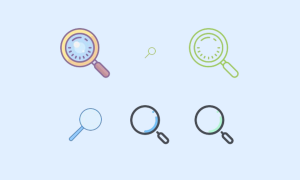
Search icons, also known as search glyphs or search symbols, are graphical representations used to signify the presence of a search functionality within an interface. These icons typically consist of a magnifying glass or a similar symbol that intuitively communicates the ability to search for content, products, or information within an application or website.
Importance of Search Icons:
The integration of search icons serves several purposes, each contributing to the overall usability and effectiveness of an interface:
- Enhancing Discoverability: Search icons make it easier for users to locate the search feature within an interface, reducing the time and effort required to access relevant content.
- Improving Navigation: By providing a clear visual cue, search icons facilitate seamless navigation, allowing users to explore and retrieve information quickly and efficiently.
- Promoting User Engagement: The presence of a search icon encourages users to interact with the interface actively, fostering engagement and increasing the likelihood of successful user interactions.
Best Practices for Search Icons:
To optimize the effectiveness of search icons and ensure a positive user experience, designers should adhere to the following best practices:
- Clarity and Simplicity: Search icons should be clear, concise, and easily recognizable, ensuring that users can identify the search functionality at a glance. Avoid overly intricate designs that may confuse or distract users.
- Consistency: Maintain consistency in the design and placement of search icons across different screens and platforms to establish familiarity and streamline user interaction.
- Visibility: Ensure that search icons are prominently displayed within the interface, making them easily accessible and visible to users regardless of their device or screen size.
- Intuitive Design: Design search icons with intuitive visual cues that align with users’ mental models and expectations, such as a magnifying glass or a search bar icon.
- Accessibility: Consider accessibility guidelines and ensure that search icons are perceivable and usable for all users, including those with disabilities or impairments.
Implementation Strategies:
When integrating search icons into your design, consider the following implementation strategies to maximize their effectiveness:
- Positioning: Place the search icon in a prominent location within the interface, such as the header, navigation bar, or sidebar, where it is easily accessible and visible to users.
- Size and Scale: Ensure that the size and scale of the search icon are appropriate for the context and screen size, allowing for easy interaction on both desktop and mobile devices.
- Interactive Feedback: Provide visual feedback, such as hover effects or animations, to indicate user interaction with the search icon and reinforce its functionality.
- Contextual Clues: Use contextual clues, such as placeholder text or prompts, to guide users on how to use the search functionality effectively and improve the overall search experience.
Incorporating search icons into your UI/UX design is a fundamental step in enhancing usability, navigation, and user engagement. By following best practices and implementing effective design strategies, you can leverage the power of search icons to create intuitive and seamless user experiences across various digital platforms and applications. As technology continues to evolve, search icons remain a valuable tool for simplifying user interactions and driving positive outcomes in design and user experience.